Agoda Booking Flow Optimization
Team Project
|
Feb 2025
| Goal : Identify user pain points and improve the overall user experience of the mobile app
| Duration : 1 week
| Role : In-depth interviews, competitive analysis, UX/UI design, usability testing
| Tool : Figma
| Link : Slide Deck
As international travel rebounds in the post-COVID era, competition among Online Travel Agencies (OTAs) has grown more intense. Despite rising usage, many travelers continue to express dissatisfaction with travel booking apps. Among them, Agoda stood out in particular due to its complex booking process and poor information clarity, making it a compelling candidate for a UX redesign.
I conducted user research and competitive analysis to uncover key friction points and reimagine Agoda’s hotel booking experience. My focus was on the needs of working professionals in their 30s to 50s, users who value clarity, competitive pricing, and a seamless, trustworthy process.
Research
Market Analysis
We began with a market analysis of the OTA landscape and identified Agoda’s competitive positioning. Despite its high app usage, Agoda consistently ranked among the lowest in customer satisfaction across major travel platforms. This gap between usage and satisfaction signaled a significant opportunity for improvement.
User Research
To better understand Agoda’s user base, we analyzed user demographics and behavioral patterns. We found that many of Agoda’s core users are working professionals in their 30s to 50s who are highly price-sensitive and seek experience-driven travel. These users place strong value on transparent pricing and a seamless booking process; however, Agoda was falling short in delivering on these needs.
A sentiment analysis of travel blogs and reviews were conducted to further explore user pain points. This revealed consistent frustrations with hidden extra charges, redundant or unclear information, and complicated cancellation and refund processes.
Usability Testing
To better understand the real pain points users face on the Agoda app, we conducted usability testing with five participants who had prior experience using online travel platforms. Each participant was asked to complete a hotel reservation task using the current Agoda app, while thinking aloud during the process.
Methodology
Observe and record each user session using screen capture and voice commentary
After task completion, conduct short interviews to discuss their experience and gather qualitative feedback
Track task success rates and time on task to identify friction points quantitatively
Goals
Identify which parts of the booking journey feel confusing or frustrating
Assess whether users can efficiently compare hotel options and complete a booking with confidence
Understand users’ emotional reactions to confusing or manipulative UI patterns
Key Findings
Information Overload & Poor Readability
Participants felt overwhelmed by the density of promotional phrases, cluttered text, and inconsistent formatting. This resulted in reduced trust in the information presented and high visual fatigue.
Unclear Price Changes
Users struggled to track price fluctuations as they selected different room options or moved between booking steps. Many noted the absence of real-time price confirmation made them feel unsure and anxious.
Distracting Dark Patterns
Urgency-driven messages (e.g., countdown timers, “only 1 room left!” banners) were seen as stress-inducing and not helpful. Instead of encouraging action, these elements caused discomfort and hesitation.
Redundant Information Across Pages
The repetition of hotel or room details across pages created confusion about page roles. Participants weren’t sure whether they were progressing through the booking or stuck in a loop.
Problem Statement
Based on the research, we identified the core problem:
“Users struggle to compare hotel options due to inconsistent information hierarchy, hidden costs, and excessive pressure tactics that disrupt the booking flow and lower trust.”
This issue became especially apparent on three key pages:
Room Selection
Guest Information
Payment Information
Competitive Analysis
We compared Agoda’s flow with major competitors by analyzing identical hotel listings across platforms. Competitors tended to:
Prioritize key info at the top
Use expandable sections for secondary content
Maintain consistent visual hierarchy
Agoda, in contrast, lacked structure and displayed poor readability.
Solution Ideation
1. Improve Visual Hierarchy & Readability
Organized important info upfront using consistent color cues (green for coupons, red for payment/cancellation)
Reduced redundant content within room cards
Streamlined copy to eliminate promotional noise
2. Address Price Transparency
Added a persistent bottom bar showing real-time price changes
Displayed coupon/discount info clearly in one consistent area
3. Reduce Dark Patterns & Improve Flow
Removed urgency-inducing phrases and countdowns
Defined clear roles for each page to eliminate cognitive overload
Merged scattered information into unified, scannable views
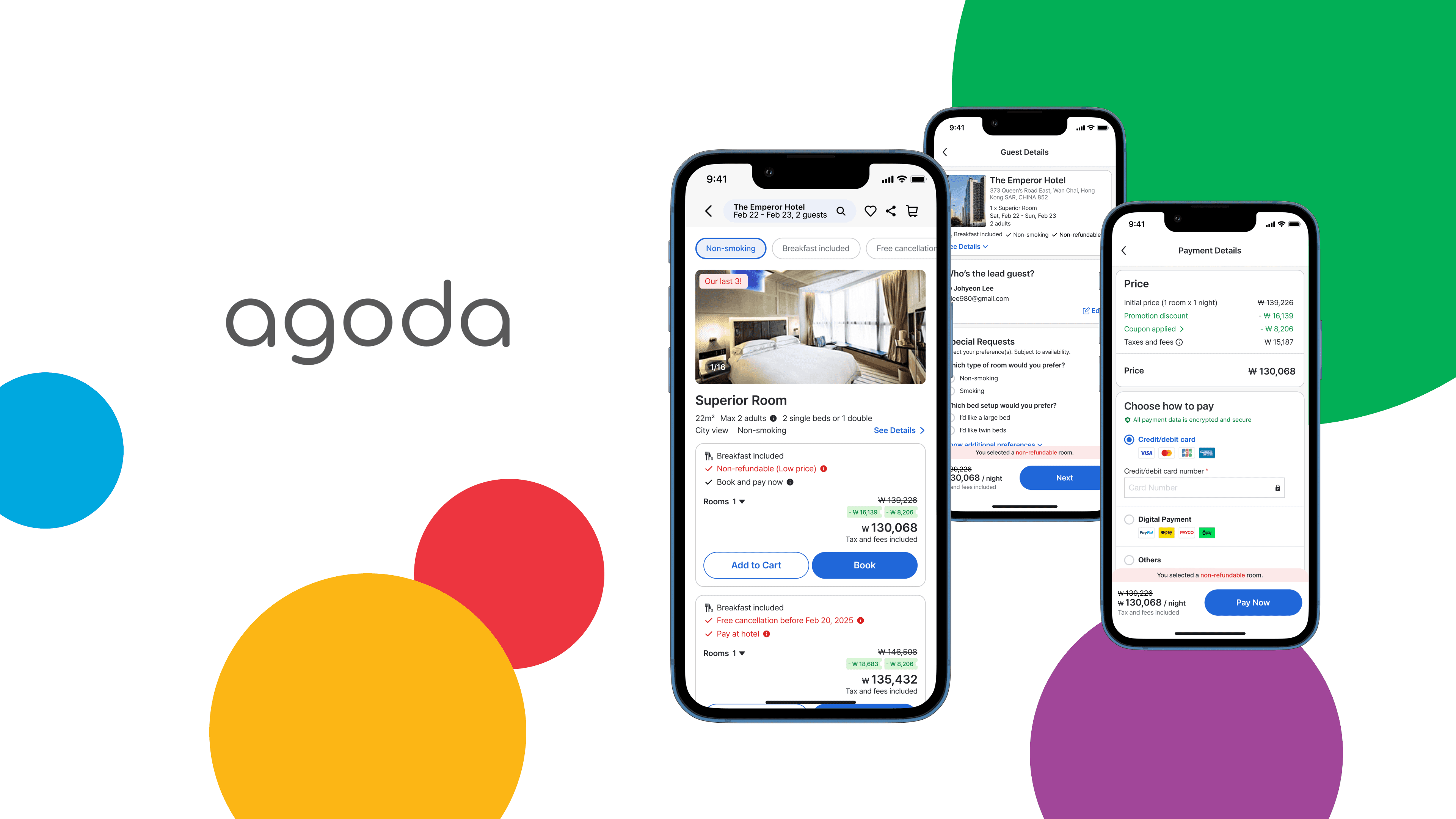
UX Improvements
Room Selection Page:
Enhanced filter chips for faster scanning
Redesigned room cards to highlight key decision factors: breakfast availability, refund policy
Grouped amenities under collapsible sections
Guest Information Page:
Condensed all fields into a single scrollable screen
Used clear section headings and eliminated unnecessary friction
Persistent price bar remained visible to reinforce trust
Payment Page:
Removed repeated room details and urgency banners
Clarified current booking stage with clear page titles
Ensured continuity by fixing key alerts and info in place
Expected Outcomes
With these improvements, we anticipate stronger user confidence, reduced abandonment, and improved booking conversion driven by clearer information and streamlined flows. By strengthening trust through a cleaner, more transparent interface, Agoda can reinforce its brand credibility and elevate the overall user experience. As domestic OTAs increasingly expand into the global travel market, intuitive and trustworthy UX will become a key competitive edge. Through this redesign, Agoda is well-positioned to minimize user friction and better serve its global audience with the clarity, consistency, and confidence today’s travelers expect.
Lessons & Takeaways
Working on this project gave me a deeper understanding of the current challenges users face on OTA platforms, and the critical role thoughtful design plays in simplifying complex booking flows. By exploring a wide range of articles, user feedback, and market reports, I broadened my perspective not just on Agoda, but on the travel industry and user behavior as a whole. Despite the limited timeframe, I found myself fully immersed in identifying key pain points and proposing meaningful solutions. Conducting competitive research also sharpened my eye for evaluating UX/UI patterns across different services, and reminded me of how impactful clarity and trust can be in digital design. More than anything, this experience underscored how intuitive, well-structured interfaces can reduce friction and build confidence in service-heavy platforms. It was a fast-paced yet deeply rewarding process that helped me grow not only as a designer, but as a user-centered thinker.